Tired City
Hands Collective reached out for a refresh of their custom typeface for Tired City. We aimed to make it more creative and true to the brand’s tone — kind of like how a chicken walks... or screams! 🐣

Tired City has been close to my heart since university, when I first bought their merch. So when they teased their rebrand, I was thrilled. It’s rare to see a brand that authentically supports artists and designers take such a bold, vibrant, and genuinely creative turn.
Oh and if you’re a foreigner, here is a little advertisement: TiredCity is a Vietnamese brand that teams up with local artists to create art-inspired fashion and lifestyle goods.

Photo by Tired City
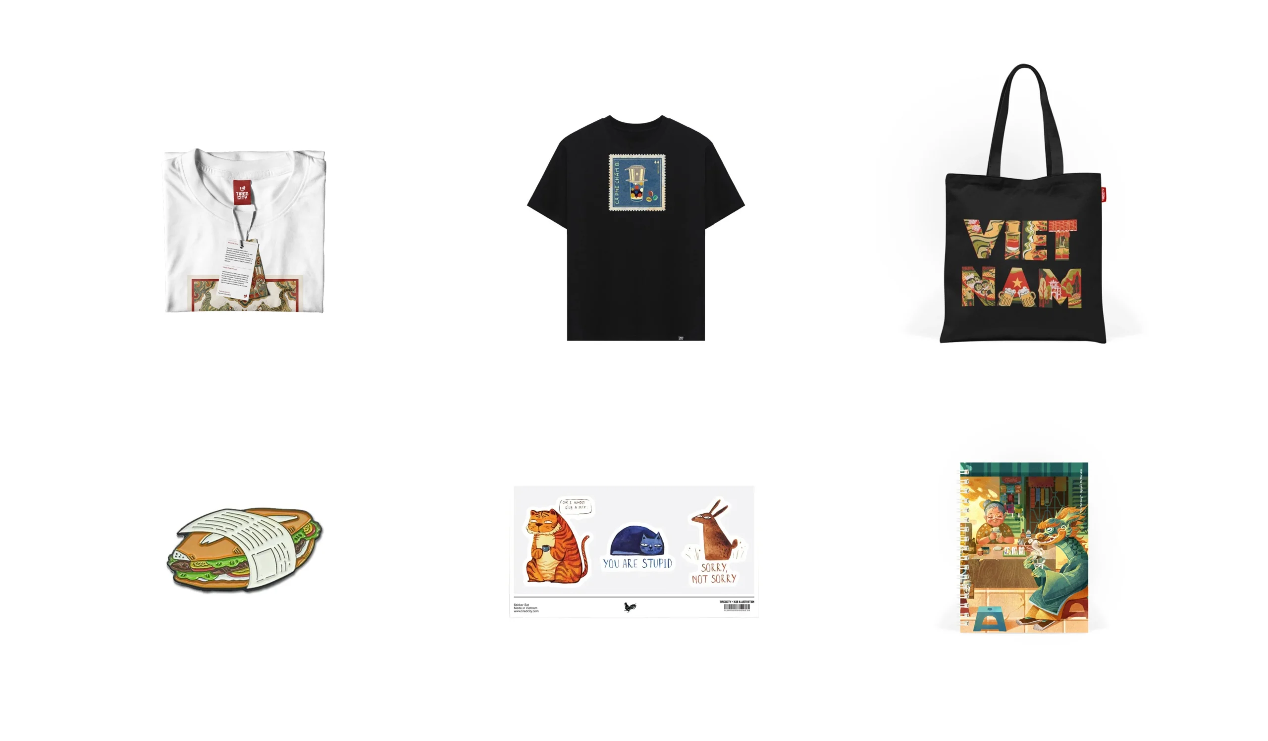

New packaging system & products for Tired city (Photo from Hands Collective)
Inspired by the Constructivist style of old propaganda posters, the logotype was elevated by Hands Collective into a bespoke typeface that speaks to both heritage and innovation.

The typeface is fun and ties in nicely with the new logo design, but there were some issues with contrast and diacritics that affected its usability. Time for a little fine-tuning!

With at least 12 styles — from Tired to Very Tired (yes, really) — it’s as versatile as it gets.
Inspired by vintage Vietnamese signage, the diacritics are intentionally thinner than the letterforms. This ensures better line spacing and allows for tight leading in bold titles, maintaining the brand’s visual coherence.

Photo from Hands Collective
Check out the full showcase and credits from Hands Collective! 👀
Selected Works

ThowRetail Typeface

HơnTypography & Type Design

Hanoi GroteskCustomized Typeface

LavisheRetail Typeface

InoSansBespoke Typeface

CelanoBespoke Typeface

LoesRetail Typeface

MayonakaBespoke Typeface

Random DisplayChallenge & Free Font

#0L Eng1I2hBespoke Typeface
Nhất HươngBespoke Typeface

PhuduOpen-source Typeface
Uh oh~ That's the end of the page.