
Hanoi Grotesk - HFCD
One day (or night I think), Nhatanh Nguyen - the founder of Đình Collective asked me for a catalogue of my sans serif, which I teased a few images on Instagram sometimes. Suprisingly, I was ordered to customized the most basic sans from it.

Photo from Kênh 14
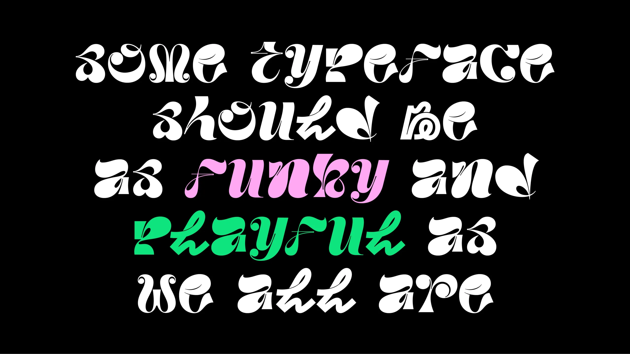
As a a holistic solution for the identity, the typeface needs to transfer the same concept from the logo mark and mascot, which designed inspire from the organized place - “Cung Văn Hóa thiếu nhi”. Architecture cuts are added to detail of each letters, alongside some open-type features like alternates, ligatures to make it more diverse. Hanoi Grotesk has 3 weights, in which the Regular used to most, while others acted as a supporting role for logotype or highlight.


Okay, why “Hanoi Grotesk”? Honestly, it’s too stressful to add a city name to a typeface. But Nhatanh is way too cool for that, and I think the word “grotesk”, which is weird or consider new, is quite suitable in the context of breathing something fresh to the city identity, as this year theme is Creative intersection. So yes, Hanoi Grotesk was born and went out like a wind.


The identity pattern was transformed into a font, so designers can simply type it out. And there's no gaps between lines in Figma make it super easy to use!

Screenshot of the re-engineering process for each letterform, with every glyph aligned to a square 2048px em box.


Photo from Kênh 14

Cool photo from Nhatanh Nguyen
Credits
Project Manager: Quan Le
Executive Designer: Thế Huy
Mascot Designer: Thủy Nguyễn
Junior Designer: Anh Duy Vũ
Website Design & Development: Tien Dat Ta
Design System Development: Tạ Sơn Quỳnh
Guideline Designer: Lan Dao
Animation Designer: Nguyễn Hữu Thiện
Photography: Đỗ Ngọc Tân
Design Assistant: Bá Điệp
Selected Works

ThowRetail Typeface

HơnTypography & Type Design
Tired CityBespoke Typeface

LavisheRetail Typeface
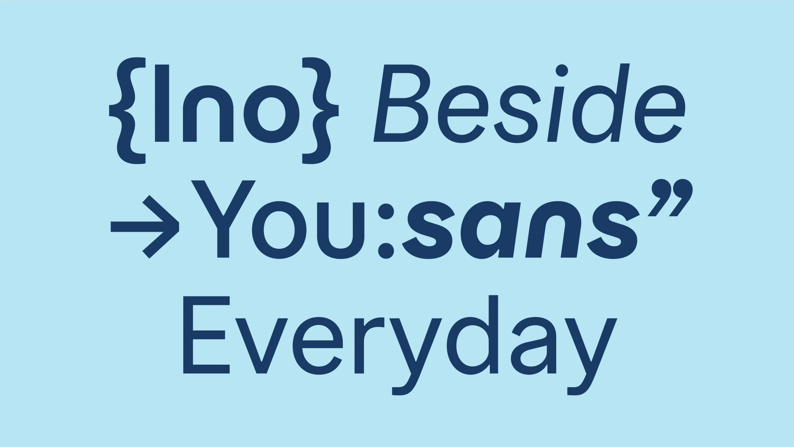
InoSansBespoke Typeface
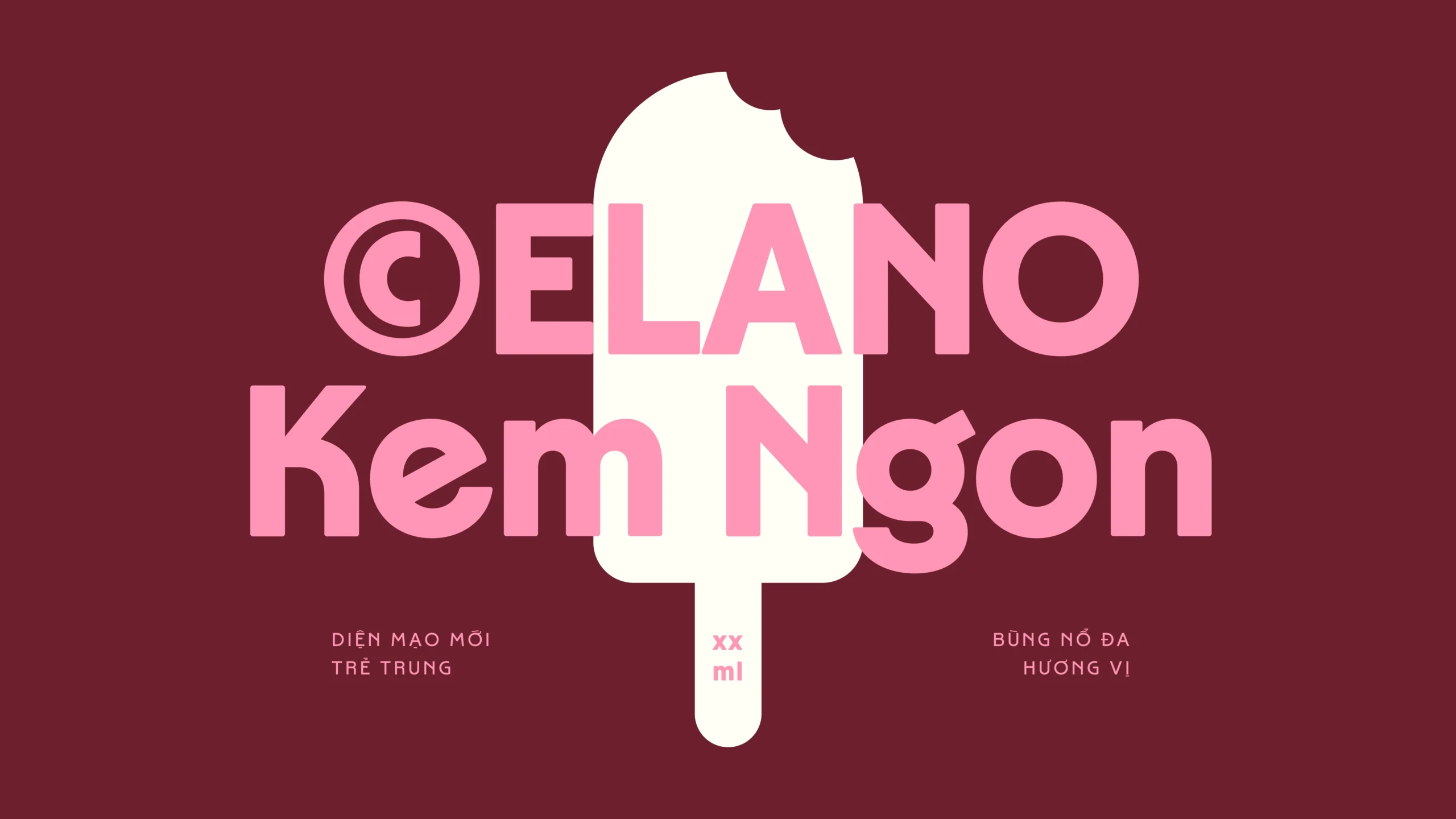
CelanoBespoke Typeface
LoesRetail Typeface

MayonakaBespoke Typeface

#0L Eng1I2hBespoke Typeface
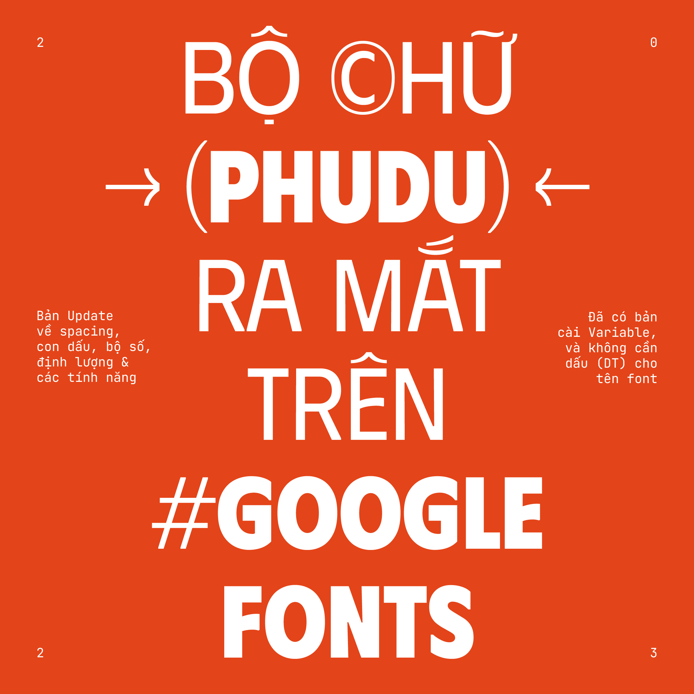
PhuduOpen-source Typeface
Random DisplayChallenge & Free Font
Uh oh~ That's the end of the page.
