
InoSans
In late 2023, I was commissioned by B&A to design a bespoke sans-serif typeface for Inochi, a household goods brand. Our goal was to enhance Inochi’s spirit and brings their tagline—Beside you every day—to life.

First things first, I need to understand what is "Inochi", and how I could translate their tone of voice into the type. To be honest, I hadn’t looked deeply into the brand before this project. I didn’t even realize they were a premium household goods brand. And I even thought they were from Japan—this point may be a good sign of the branding work.
Motions from B&A Agency

After reviewing the old brand typeface—Averta, we agreed that there were quite a few redundant details that needed to be removed. The new typeface also had to capture the premium feel that was previously missing.

I began by exploring what genre the Inochi typeface should fall into. The geometric shapes in their logo naturally suggested an industrial, functional feel—which aligns well with their product line. However, that alone wasn’t enough to define the direction. We didn’t want the typeface to feel cold or overly mechanical. Instead, it needed to embody the brand’s essence: the sense of quality, care, and everyday presence that Inochi brings to its customers. That’s why I proposed the name InoSans—a play on both “sans-serif” and “Sans” in Japanese—and envisioned it as a blend of friendly grotesque and clean geometric styles, aiming for a universal, approachable tone.


The capitals are subtly narrower compared to the lowercase to optimize spacing—especially on packaging, where the typeface is most frequently used.

InoSans brings a warm and playful vibe with its rounded, creative details—taking inspiration straight from Inochi’s product design and brand spirit. Its open terminals, unique textures, and unconventional proportions contribute to a distinctive and unpretentious character.


Available in upright & italic styles, and with two optical sizes, InoSans offers optimal versatility for a wide range of applications.
Let's not forget about Vietnamese diacritics, which were carefully adjusted and optimized to fit within the line height.

Let's check the outcome shall we!
Motions from B&A Agency
🫡 You can check out the full amazing showcase of the Inochi brand by B&A Agency below—it’s just Volume 1, since they’ve done so much work on this branding project.
Selected Works

ThowRetail Typeface

HơnTypography & Type Design

Hanoi GroteskCustomized Typeface
Tired CityBespoke Typeface

LavisheRetail Typeface
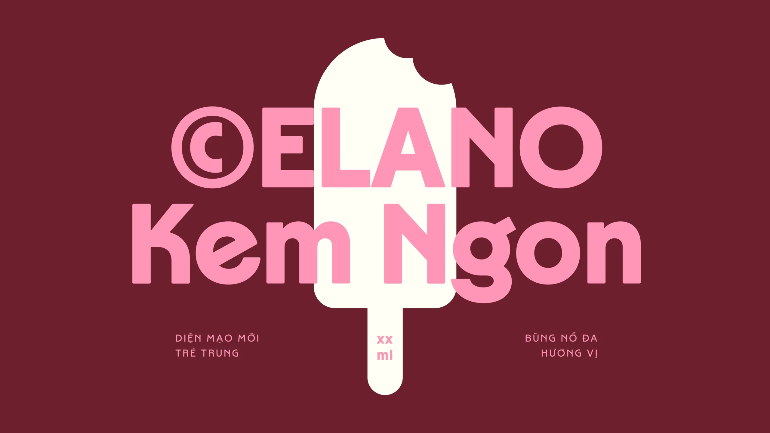
CelanoBespoke Typeface
LoesRetail Typeface

MayonakaBespoke Typeface

#0L Eng1I2hBespoke Typeface
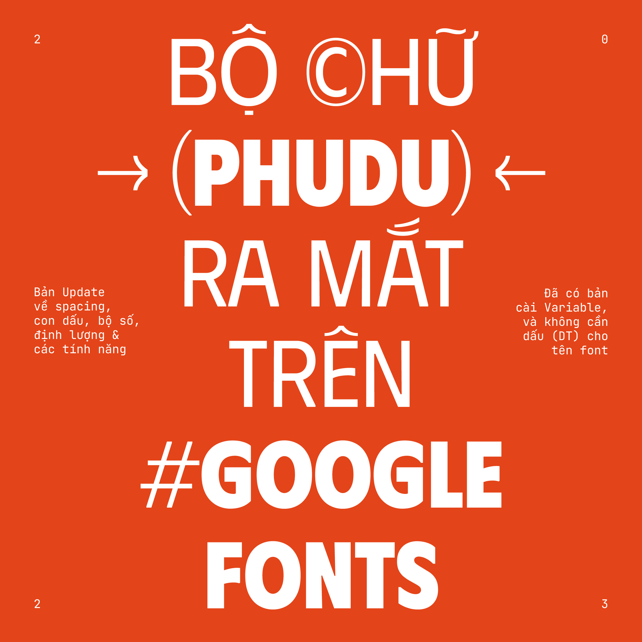
PhuduOpen-source Typeface
Random DisplayChallenge & Free Font
Uh oh~ That's the end of the page.
