Celano
Commissioned by Bloom Creative to design a bespoke typeface for Celano, a premier childhood ice-cream brand in Vietnam.
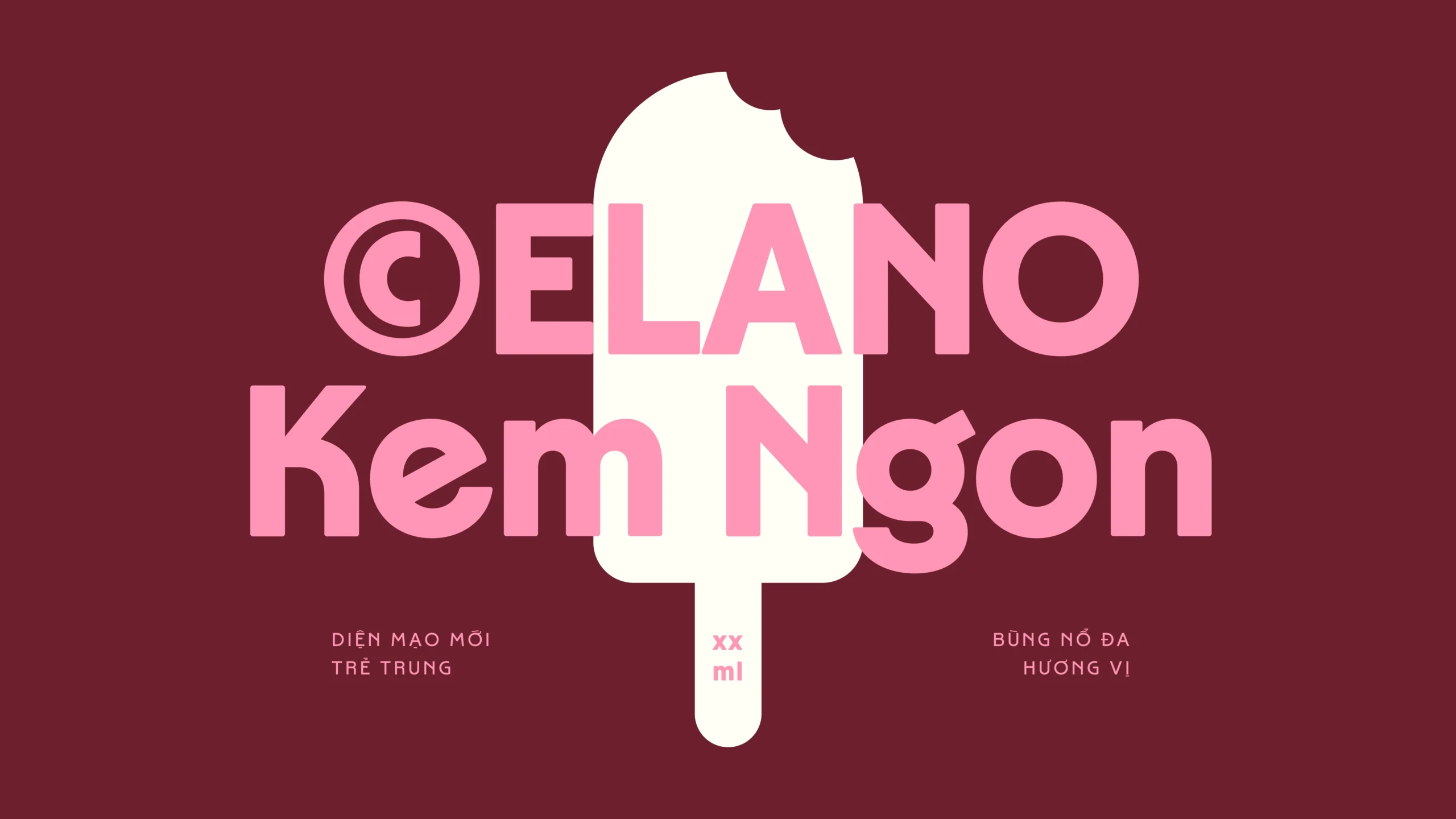
The typeface was launched as part of the brand's major redesign under the direction of Bloom Creative. As the brand transitioned to appeal to a younger audience, the goal was to make the typeface - serving as the brand's main voice - feel playful and youthful while preserving a sense of Vietnamese nostalgia to honor the brand's origins.

After digging through old images, we realized how well the Foire de Hanoi aesthetic aligned with the typeface concept. At the time, Art Deco had a significant influence on Vietnamese signage and typography. We explored these reference shapes further, infusing each glyph with as much joy and playfulness as possible.


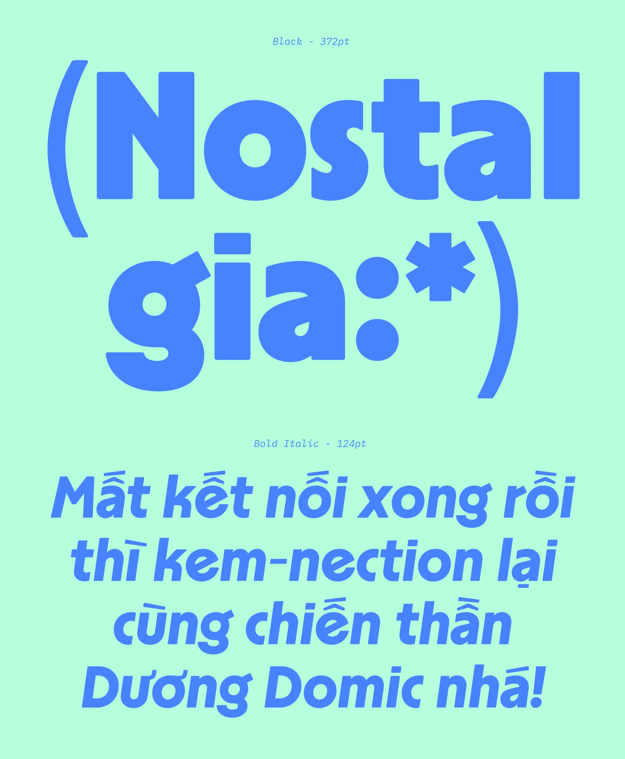
The design approach focused on embracing the diversity of individual letters rather than aiming for uniformity. We then expanded the typeface into 6 styles, including Italic, to accommodate a range of applications.


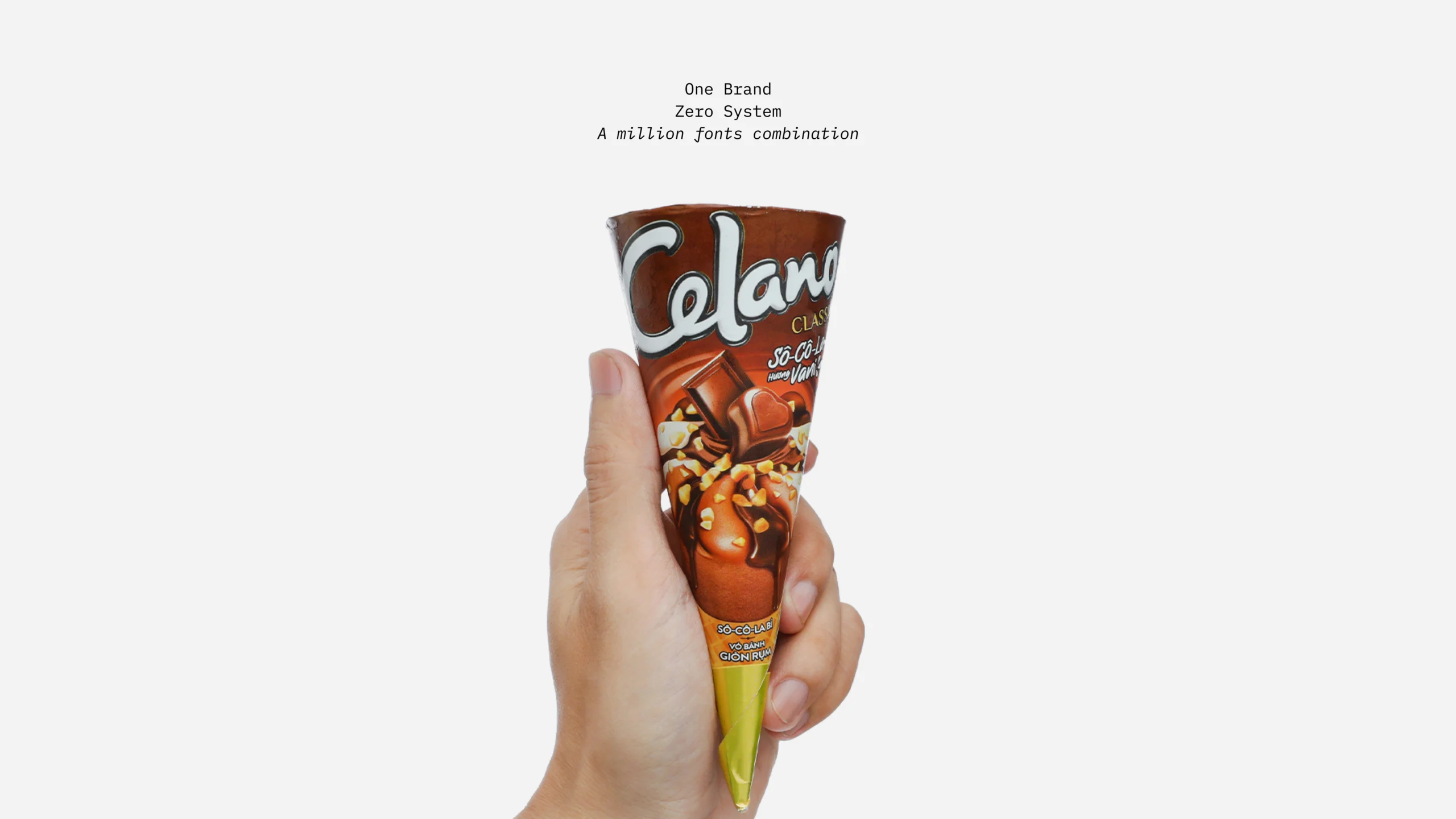
Some photos I snapped while buying Celano at the nearby supermarket 🫢


Credits
Design Studio: Bloom Creative
Art Director: Kuro
Project Manager: Lana
Selected Works

ThowRetail Typeface

HơnTypography & Type Design

Hanoi GroteskCustomized Typeface

Tired CityBespoke Typeface

LavisheRetail Typeface

InoSansBespoke Typeface

LoesRetail Typeface

MayonakaBespoke Typeface

Random DisplayChallenge & Free Font

#0L Eng1I2hBespoke Typeface
Nhất HươngBespoke Typeface

PhuduOpen-source Typeface
Uh oh~ That's the end of the page.